


User Interviews - Main Goals
Test validity of assumptions about the influence dialect, diaspora history, etc on learner needs
Connect with “Viet Kieu”/ their loved ones - determine needs and goals
Discover unique joys and frustrations of learning Vietnamese outside of Vietnam
Round 1 Participants
3 Vietnamese Americans seeking to improve their Vietnamese
2 Romantic partners of Vietnamese living in the US (2 spouses, 1 fiancée)
Interview Methods
1 in person
2 phone
2 video chat
After the first round of interviews and affinity mapping, I realized that the needs of these groups diverged significantly, so I picked one user type to focus on - the romantic partner. That said, I felt it was important to keep the desires of the Vietnamese American user type in mind for potential features for a "later release." I also found that there was at least some overlap between the experiences of both, as well as a source of validation for some of my earlier assumptions around dialect and use case.

“I need an app that can take me from a child’s level of Vietnamese to a more sophisticated, adult version. It’s so hard to learn the vocabulary to do that.”
“I need an app that really focuses on mastering the basics, especially the pronunciation. I’m starting from scratch.”

Round 2 Participants
3 more romantic partners (all spouses) of Vietnamese living in the US
These last 3 interviews rounded out the first two of the romantic partner interviews and focused the research that would come to help devise the problem statement.
Define Phase
Deduce patterns and themes
Themes Emerge
Dialect a major concern
Users want to overcome isolation and confusion in family settings
Users want to learn for family but not necessarily with family
Users are overwhelmed with the learning curve
Users need accountability & feedback for pronunciation mastery but appreciate having a space to fail in private
Sketches Begin
I also began sketching at this point - jotting down feature, screen, and brand ideas if they popped up as a result of an interview!
The current offering of Vietnamese language learning apps don’t serve the needs of a major learner group - those learning Vietnamese for communal use outside of Vietnam.

Interviews painted a rich picture of the emotional and practical needs of users. This persona gives a detailed look at the user type in question.

Develop
With clear persona needs and goals, I narrowed down the essential features:
Can Come Later
Must-Have
User Flow
The feature set and early sketches converged into this flow:
Deliverable: User Flows

Develop
Using the feature list and task flows, I began hand-drawing low-fidelity wireframes of key screens.
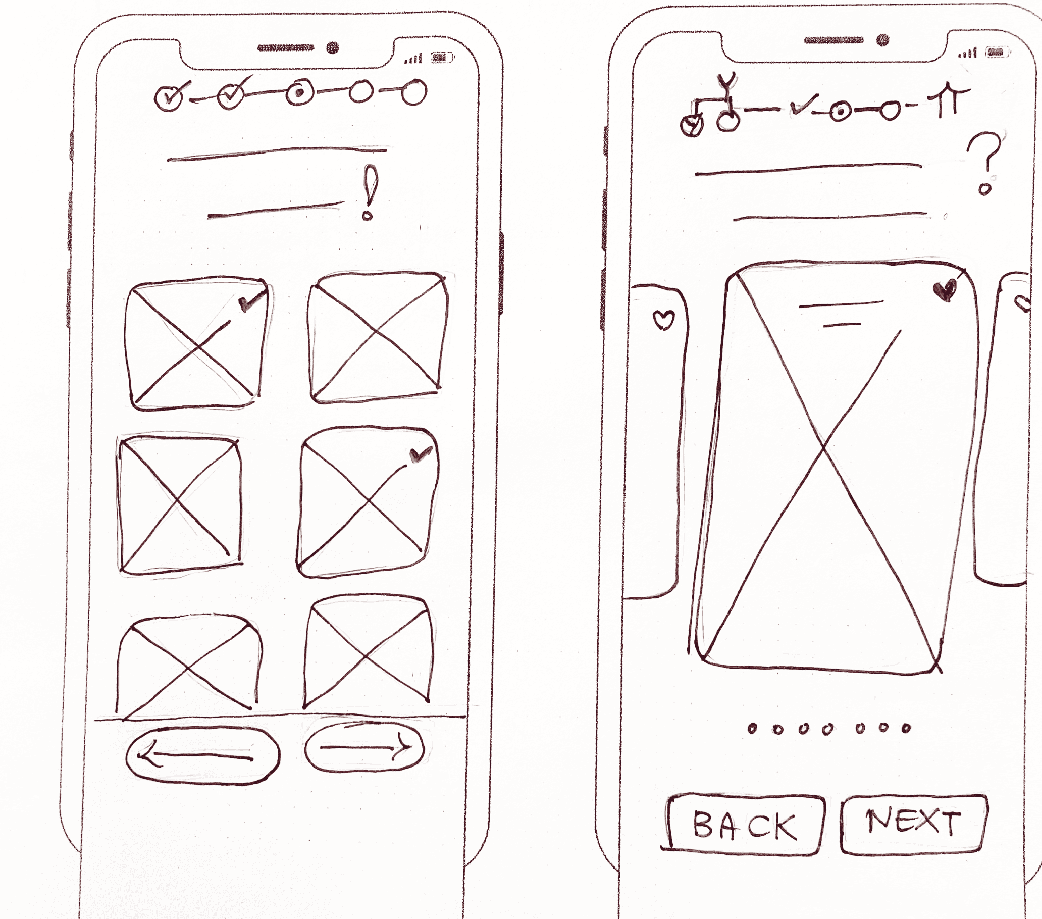
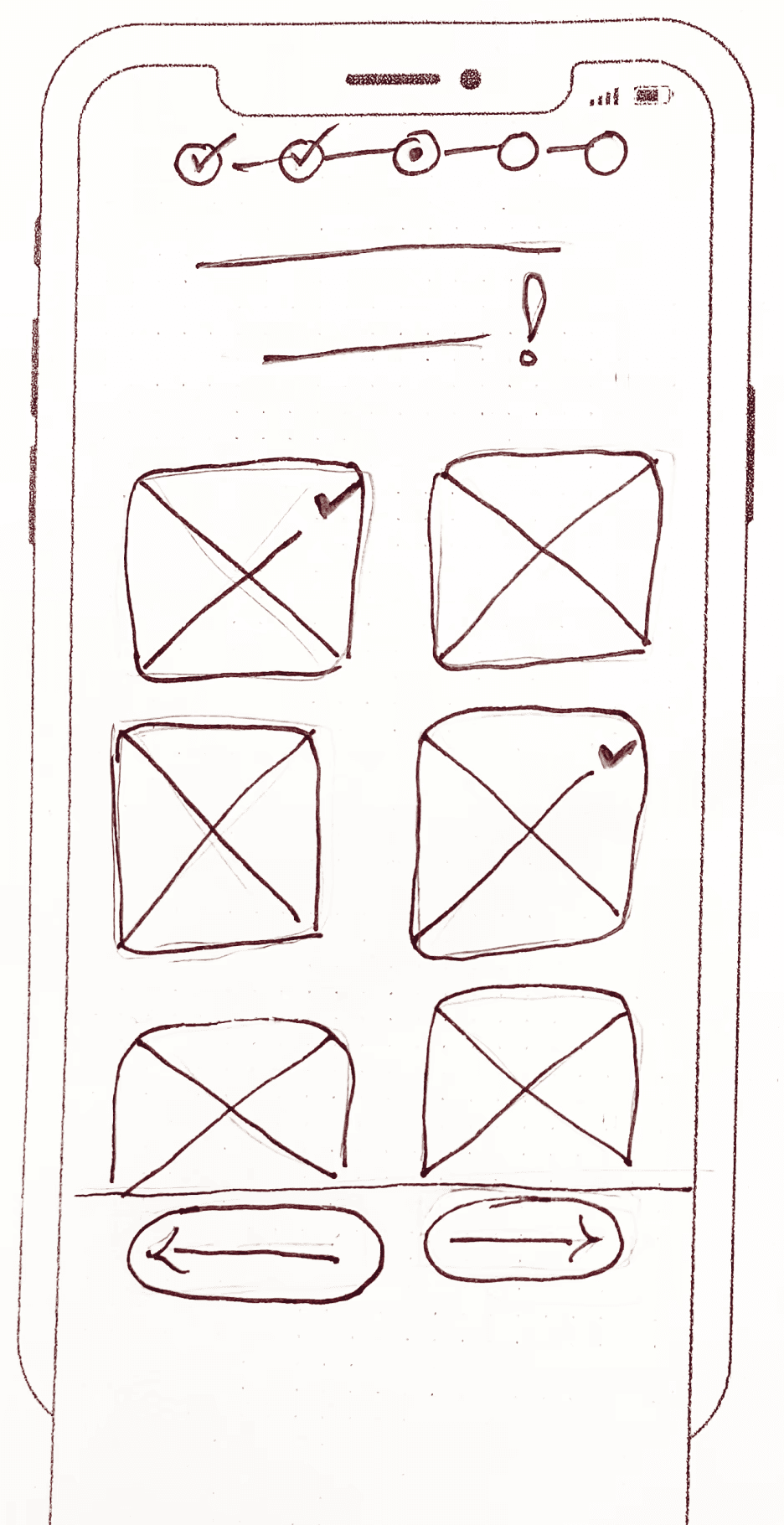

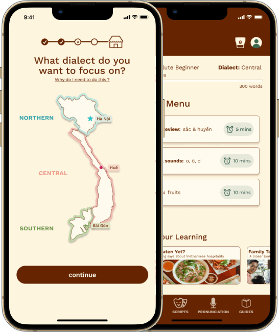
Onboarding Dialect Selection Options

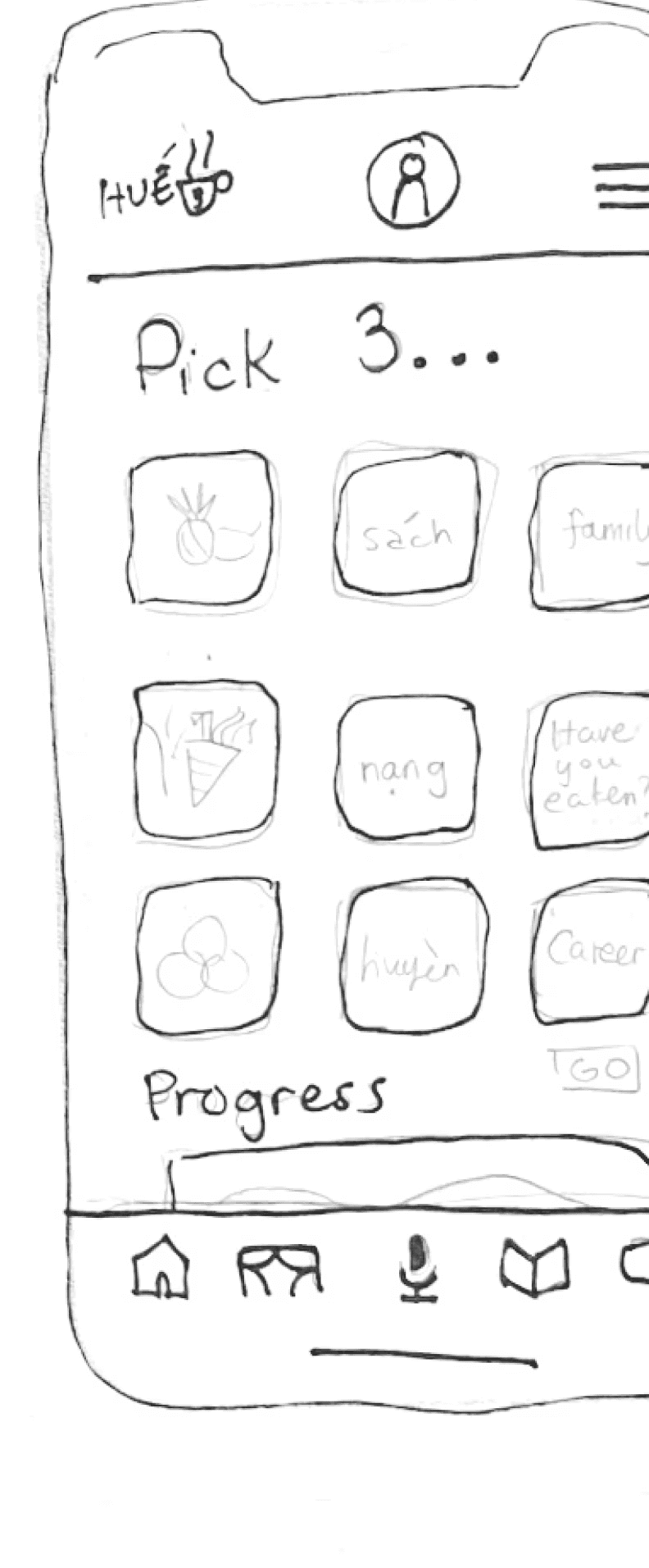
Dashboard Options Round 1
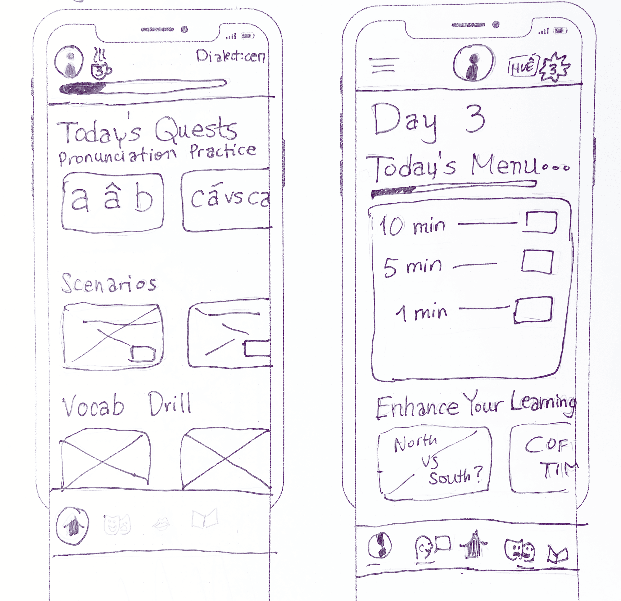
Dashboard Options Round 2
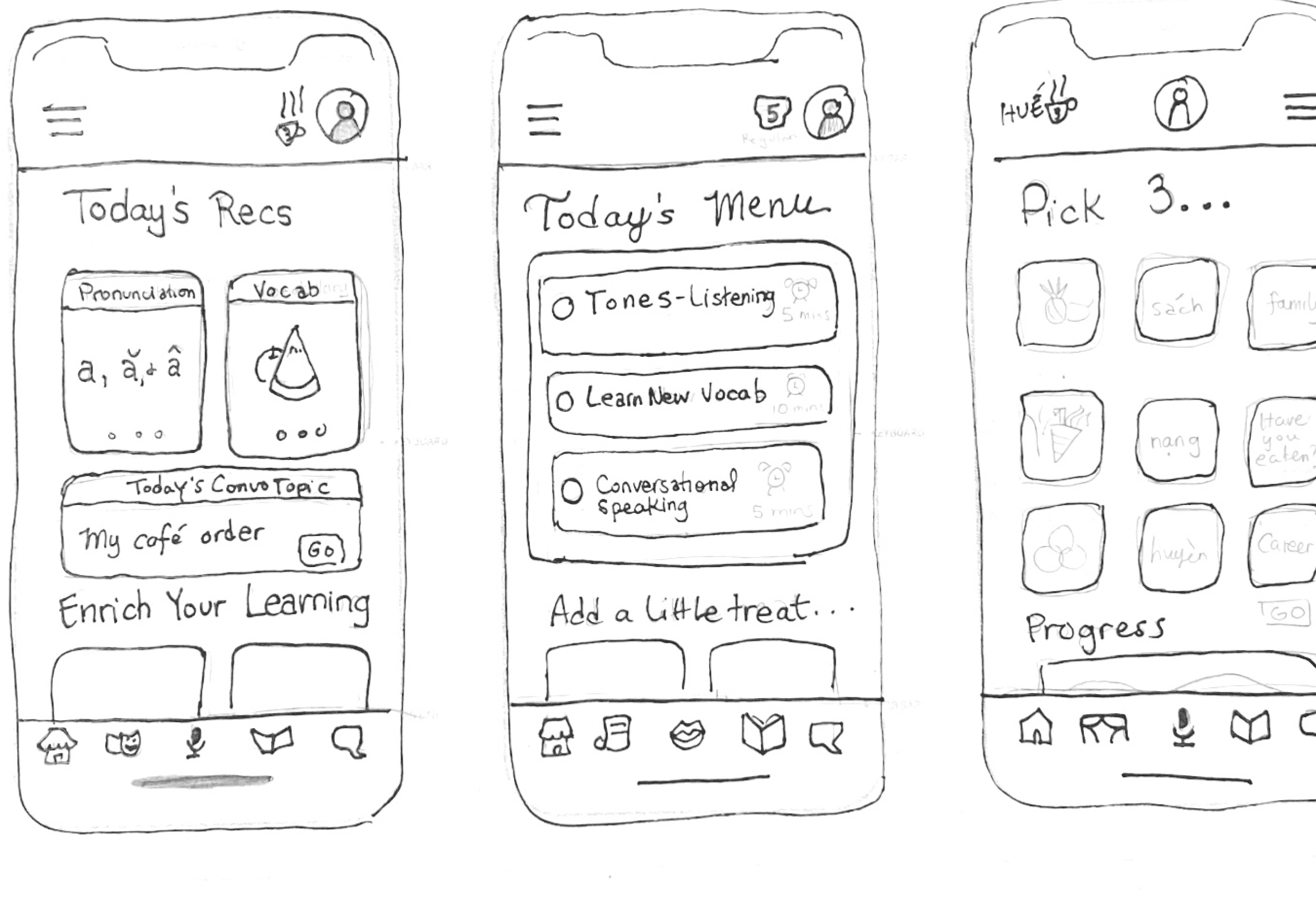

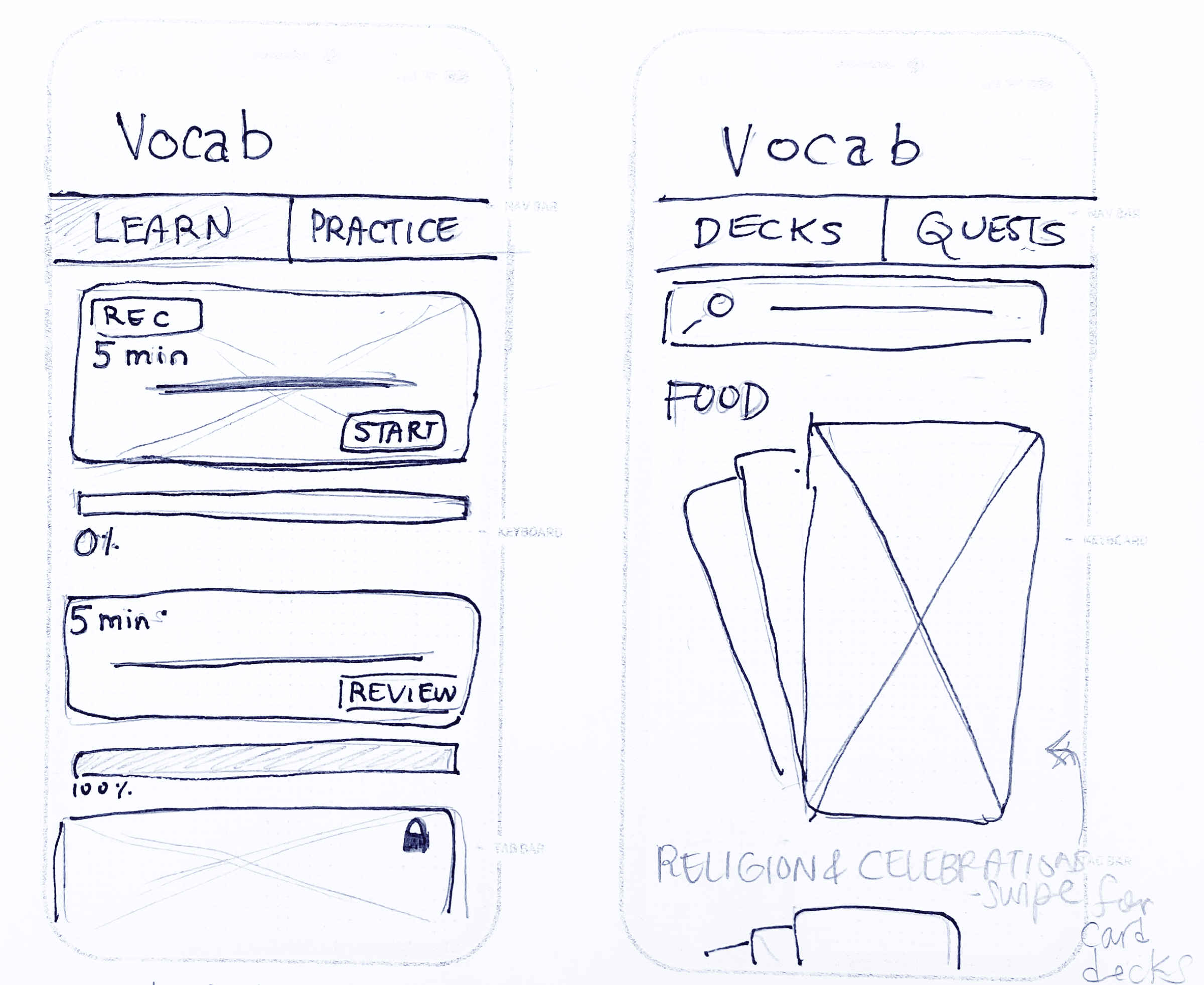
Vocabulary Practice Home Options


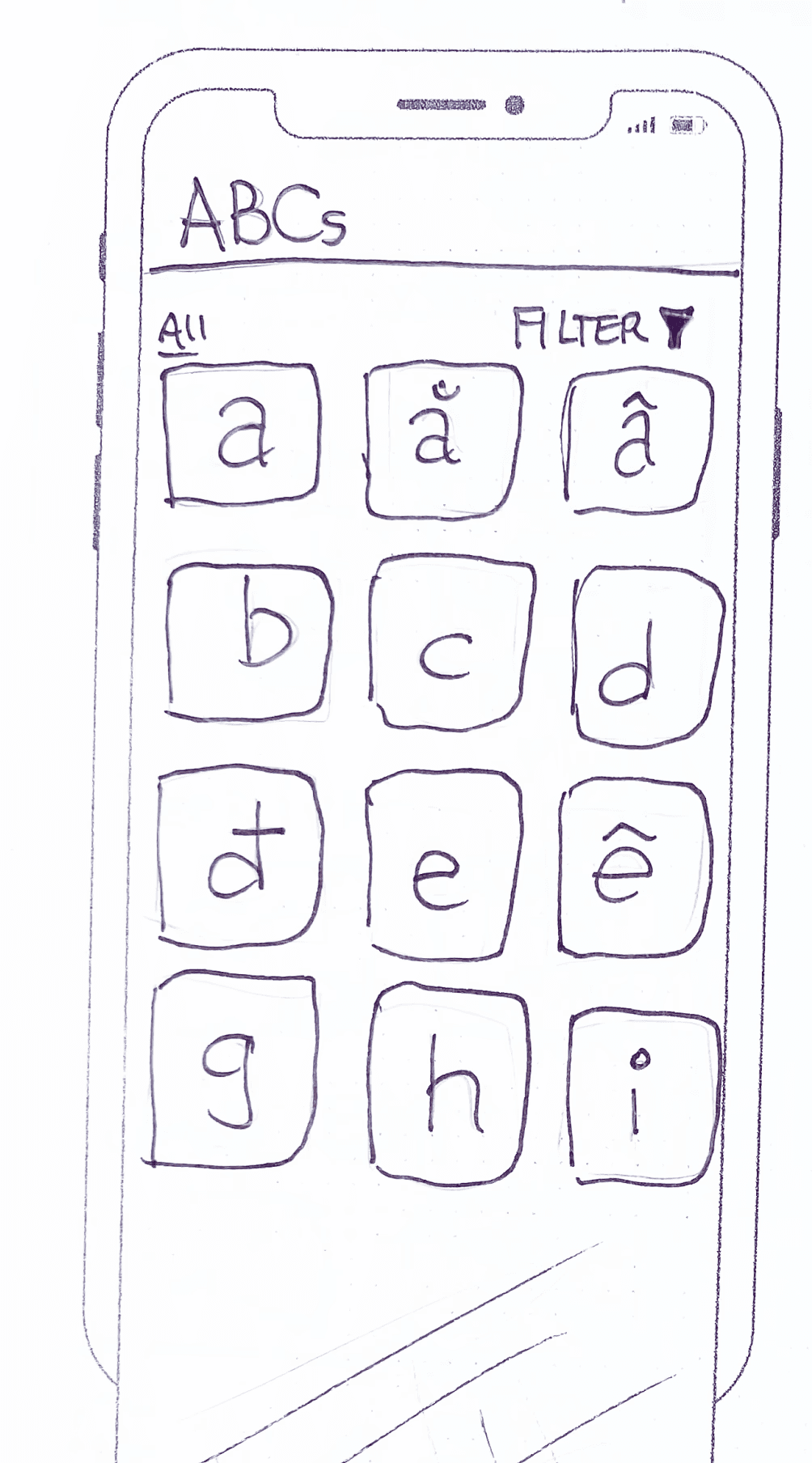
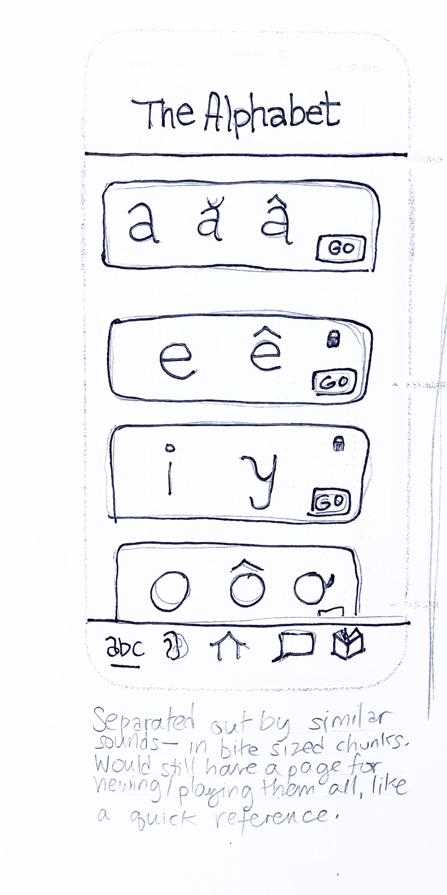
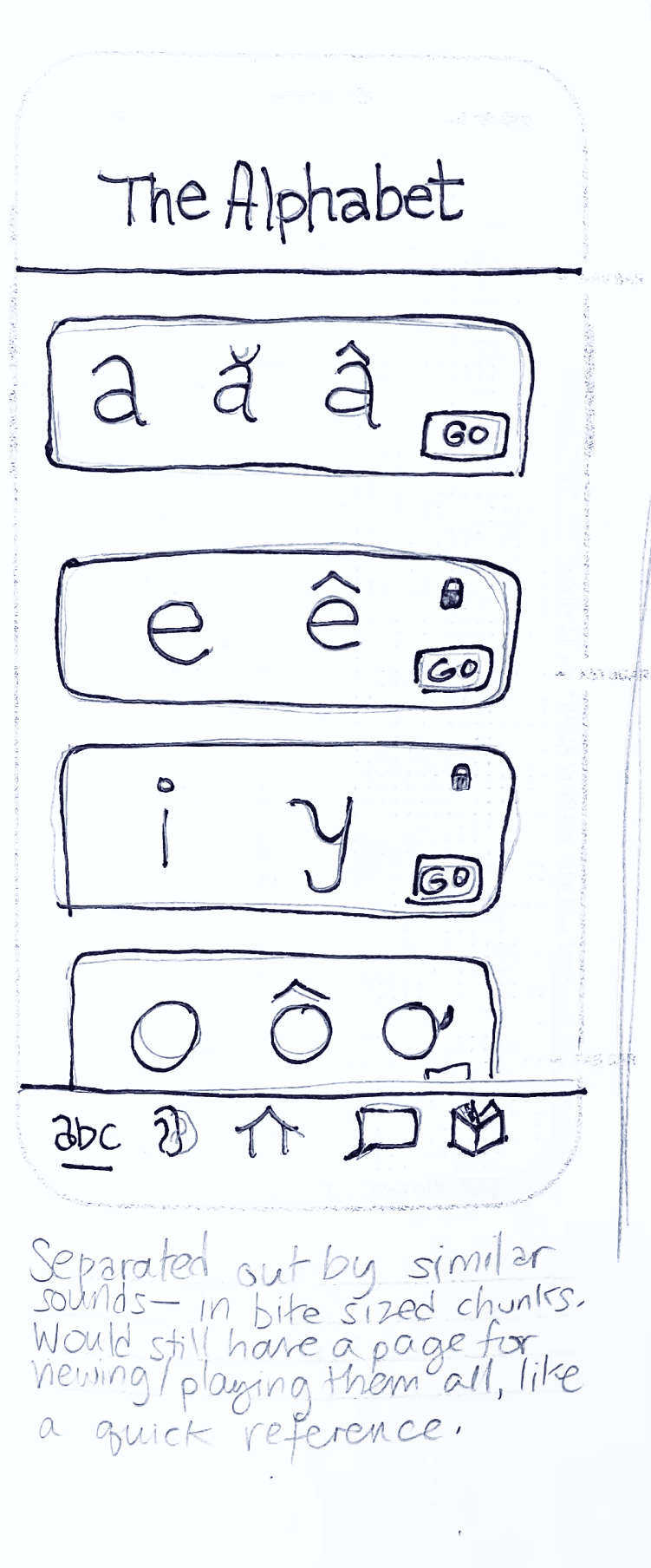
Alphabet Options


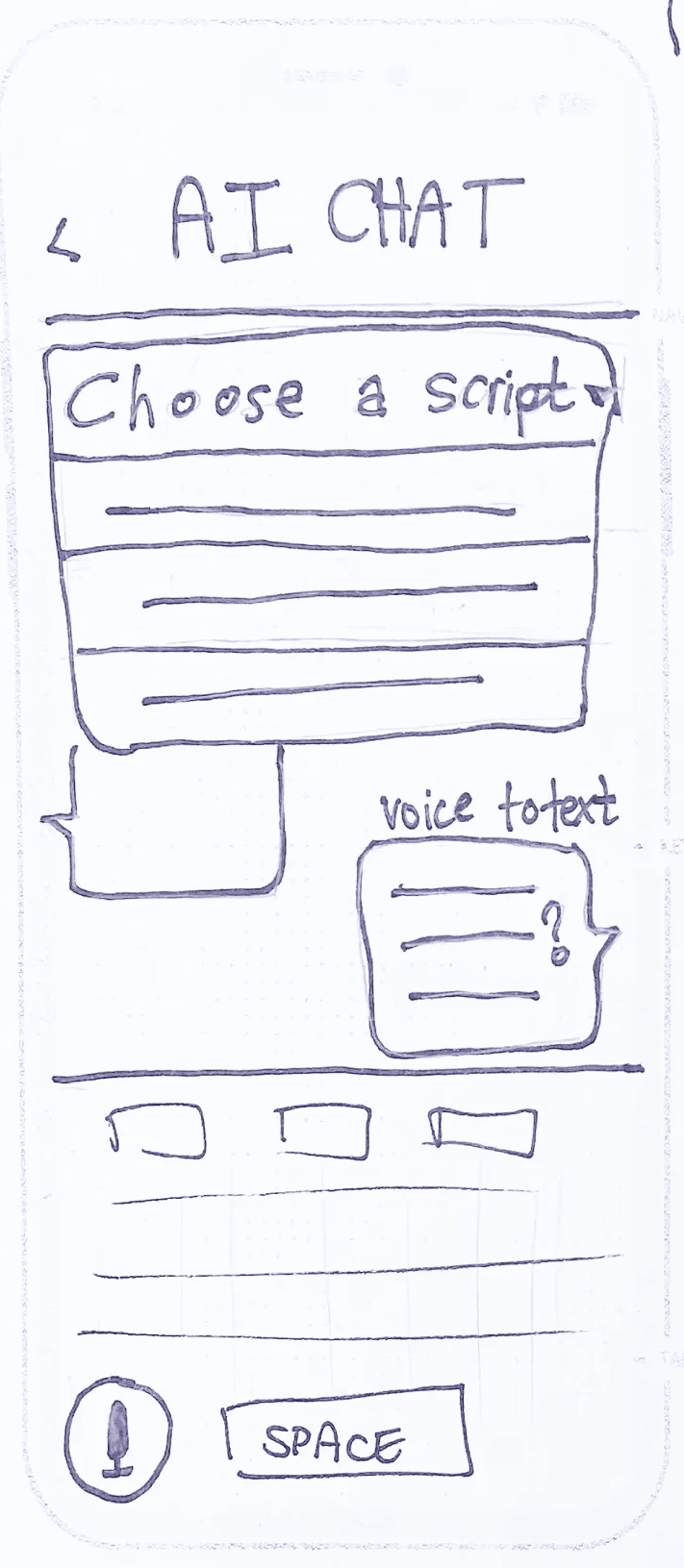
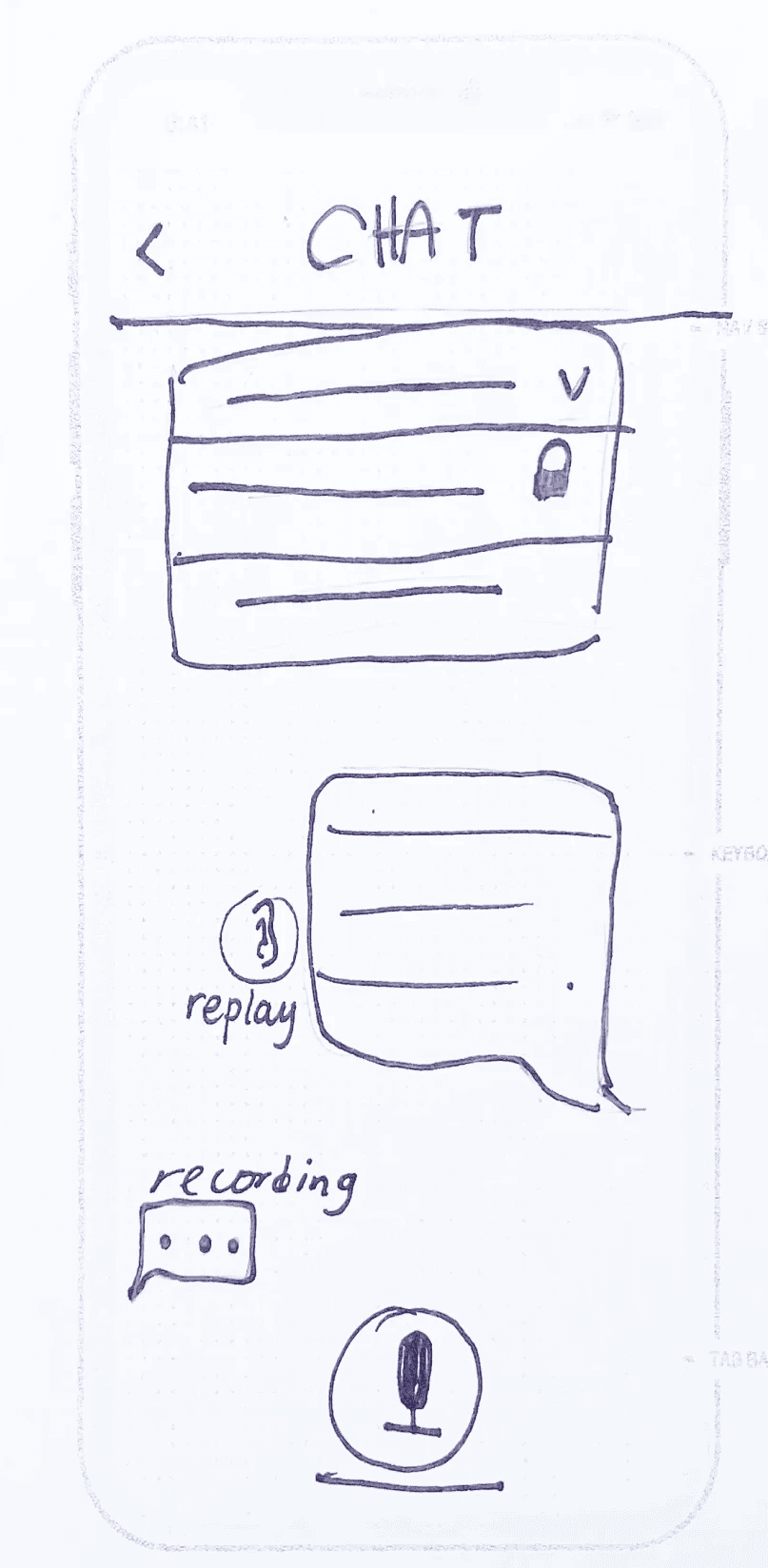
AI Chat Interface Options


Testing
Before bringing these wireframes* into the next level of fidelity, I tested them with 5 new users via Zoom.
Participants were sourced via various language learning subreddits, all fitting the following criteria:
Learning Vietnamese for communal use (friends and family)
Not living in Vietnam or planning to
Emphasis on conversational learning
Sample Questions
How do you think these set of screens would work?
Where would you click to find out more about a specific dialect?
Which dashboard option stands out to you?
How would you switch between practicing the Alphabet and Tones?
What do you like about Option A/B?
Design
Fellow students and mentors also suggested:
Less “rounded” corners
A professional “ratio” of neutral to accent colors
A tighter grid for the bottom navigation
On the other hand, feedback about the branding (coffeeshop, iconography and illustration, etc) was overwhelmingly positive, so I brought those aspects into the next iteration.


Testing
I ran another round of usability tests via Zoom with 5 more Redditors. They completed 3 task flows and gave feedback on the Dashboard and general information architecture of the app.
Main Takeaways
Overall feedback was positive, with commentary that it looked like I “spent a lot of time” on the app, that they wished it were real, and that if it were, it would replace their current app usage. Here are some features that specifically contributed to the positive feedback:
Customization
Users gave positive feedback on customization aspects of the app, especially the dialect selection screen. Users also appreciated that the Scripts (vocab) session prioritized user choice based on topics of interest.
Intuitiveness
The onboarding flow and the information architecture of the app was favorably received. Most users found that the app structure was intuitive and conformed to expectations for a language learning app.
Time-Stamping & Suggestions
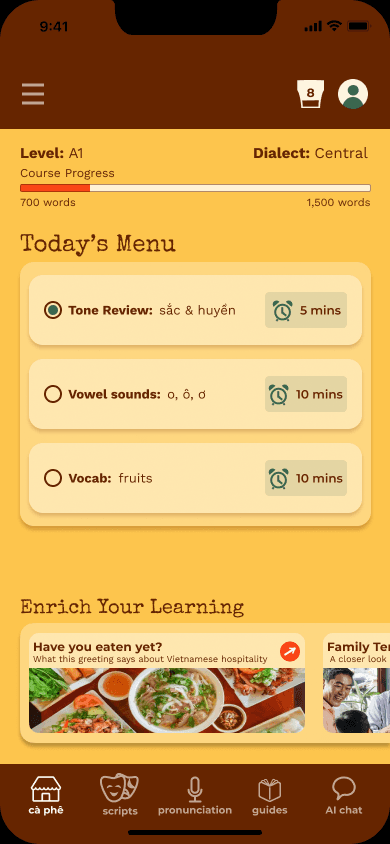
Most users considered themselves very busy, with variable available time for daily study on the app. The time stamping and recommendations received positive feedback, since users said it would help them maximize their learning time on particularly busy days. This design choice also contributes to user stickiness, since users know that the app always allows for daily progress, no matter how pressed for time they are.
Attention to Phonetic Features
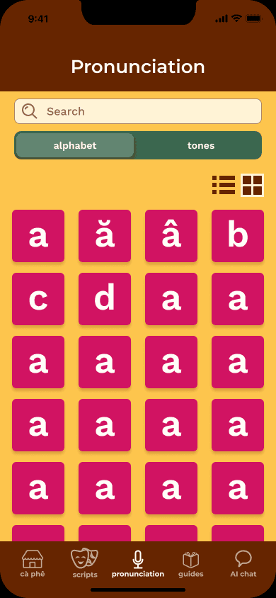
Another screen that got strong positive feedback was the individual letter screen. Users mentioned that the features on that screen - listening and recording oneself, receiving feedback on the pronunciation, and comparing pronunciation with similar sounds would help them solidify their understanding and usage of the different sounds. These screens were also built in response to the "failing in private" request of some of the users. The pronunciation section is designed to maximize feedback and minimize discouraging public failures.

Final Thoughts & Next Steps
I initially chose a soccer-themed app for my end-to-end project. I thought that it would be simpler, and I was worried that I'd get tempted to get lost in the weeds if I chose a topic I'm knowledgeable and passionate about. Overall, I think my background knowledge helped me form a more 360 view of the problem at hand, and ask more insightful and empathetic research and interview questions. It was easier to bring in the assumptions and test them than to go in with almost no knowledge of the problem space at all.
I also learned (re-learned) that you can't design a language learning app for every user. Casual users, users in one country or another, heritage learners…they all have vastly different needs, and some groups simply won't get as much out of an app. In some ways this reflects the challenges I had in the classroom - everyone has different levels of motivation and preferences for how they learn.
I'd like to continue my conversations with those partners of Vietnamese, as well as heritage learners who are struggling to go beyond a certain level of Vietnamese. Features discussed for the Vietnamese-American user type would center around acquiring more advanced vocab. One potential feature was "clickable stories," in which users can read an appropriately leveled story and click directly onto words they don't know, interact with and save them to a bank for later review. An app that could help both user types would be unique, especially since few apps seem to cater to heritage language learners as it is.
Thanks for reading about this project journey!